


The Brief
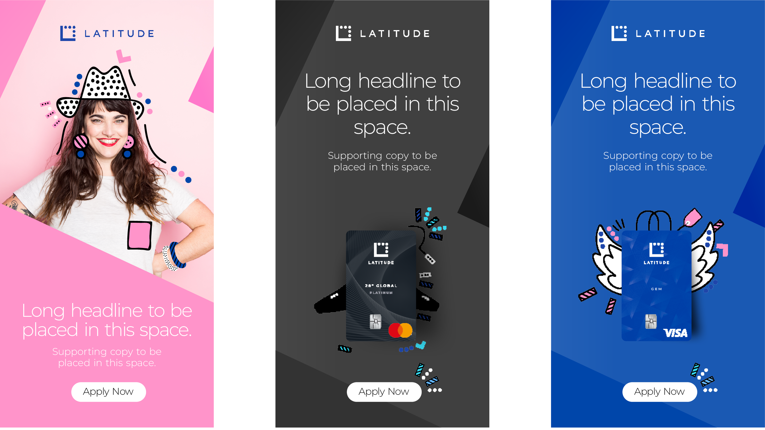
As a disruptive neo-bank, Latitude needed a visual language that felt worlds apart from traditional, legacy institutions. They didn’t want to look like a “bank”—they wanted to look like a lifestyle partner. The challenge was to move away from cold, corporate aesthetics and create a brand world that felt as energetic and agile as the digital-first customers they serve.
The Solution
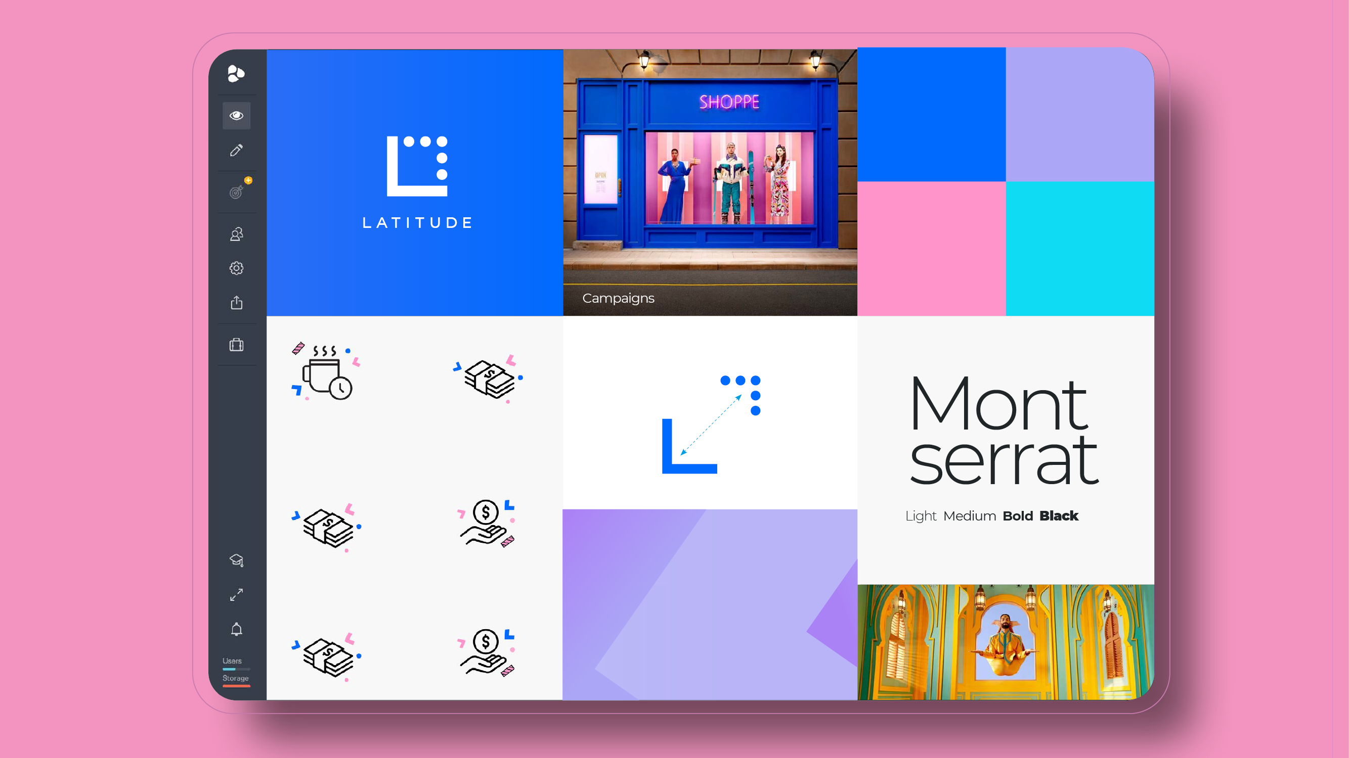
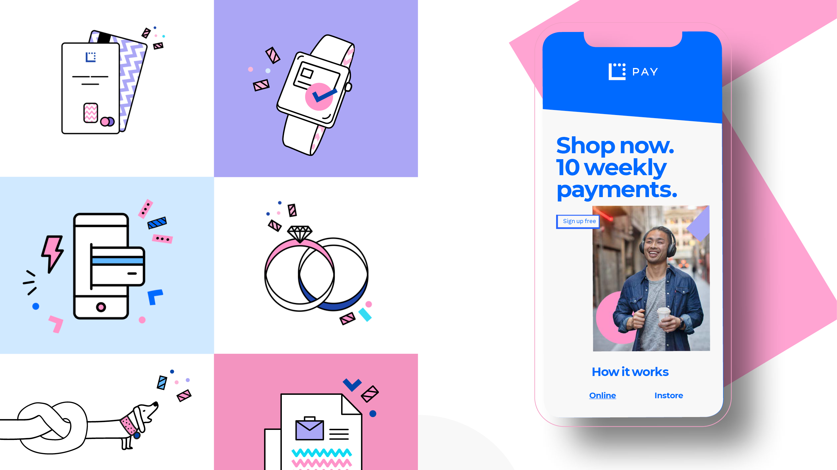
I developed a comprehensive, bespoke illustration library and icon set designed to inject energy and optimism into the Latitude digital experience.
The style is defined by bold linework, a vibrant palette, and a sense of movement, reflecting a brand that celebrates the “endless possibilities of life.” By focusing on “fun” and “human” moments rather than dry financial transactions, the new system helps demystify finance. The result is a modern, approachable, and distinctively Australian visual identity that thrives across every digital touchpoint.